Point of Sale

I led the redesign of the Point of Sale. My role encompassed product strategy, user research, prototyping, and interaction design. Spanning from November 2021 to August 2023, the project aimed to enhance user experience, unify purchase processes, and create engaging transactions. Through research, ideation, and design iterations, the goal was to modernize the Point of Sale system and meet user preferences while aligning with business goals.

Role:

Product Designer


Responsibilities:

Product strategy, user research, prototyping & testing, user interface & user experience


Project Duration:

November 2021 – August 2023

Problem:


The existing MindBody Point of Sale system faces usability and efficiency challenges, including a disjointed interface, slow transactions, limited product and payment support, and a lack of engagement features. These issues impact Mindbody clients in all verticals. 

Research:


Conducted a study to understand point of sale. Created user persona for our verticals. Identified user pain points for clients in all verticals including gyms, spas, salons, and different types studios. This allowed us to have a better understanding of our different types of users.

Insights:


From our research study I looked into areas where our customers needed improvement. A reoccurring concept was outdated and slow software experience, which consisted more of a back end update. 


  • Customer Needs
  • Modern POS
  • Purchase workflow training

Additionally looking into identifying specific pain points and features. Divided pain points into 4 buckets.


A few of the problem focus areas I focused on were:


  • Too may clicks/steps
  • Slow software
  • Feature improvements
  • User interface 
  • User experience

How might we simplify the Point of Sale system while providing a seamless and efficient transactional experience for businesses, catering to a diverse business client base, and ensuring a modern, intuitive, and engaging interface?

Current ‘Checkout’ Experience:


Initially the main focus chosen was to improve the ‘Checkout’ experience within the appointment screen.


  • Allows the client to stay on the appointment screen
  • Quick checkout 
  • Alternative experience to ‘Retail 2017’
  • “Multi-task experience” (No real multi-tasking ability)

Initial Ideation and Wireframes:


With the start of creating our new design system I used the side panel element for this experience.


Created wireframes for a more convenient and interactive experience. Addressed the client needs.

Exploring preliminary ideas for side panel POS experience
Exploring spacing, components, hierarchy
Refined iteration, user flows | At this stage limitations started to arise
Side panel 'Checkout' concept

Pivot:


After completing some research, audits, and creating proofs of concepts I identified issues with the side panel concept, such as creating a full catalog experience and limitations to the point of sale experience our customers needed.


  • Clients requesting an experience found in ‘Retail 2017’
  • Pendo Data: ~70% of our client base was utilizing Retail 2017 (Full POS experience) and not Checkout Experience.

I decided to convince leadership and the team to build a new Point of Sale system from the ground up taking a look at core UX problems and the point of sale system holistically. The main focus would be ‘Retail 2017’. Then build a smaller version of this experience for appointments.

Current ‘Retail 2017’ Experience:


Current POS UI with catalog

Pain Points:


  • Screen reload after each input (Slow)
  • No catalog browsing experience
  • Right to left catalog inputs
  • Dated look and feel
  • Subpar user experience
Audit of user flow | Areas of opportunity to eliminate or improve | Focus area: Catalog

Competitive Audit: 


During our competitive audit, I examined the experiences by prominent industry players, including Square, Toast, Stripe, PayPal, and Shopify, among others. A prevailing and effective pattern I observed across these platforms was the implementation of a progression-based user flow. This flow encompassed several key stages, from catalog browsing and item selection to payment method choice and order confirmation. 


In addition to this central insight, our audit highlighted several other key points:


  • User-centric design: Prioritizing user convenience and efficiency in the transaction process.
  • Cross-platform consistency: Ensuring a uniform experience across web and mobile interfaces.
  • Payment flexibility: Offering multiple payment methods and security options.
  • Accessibility considerations: Implementing features to cater to a wide range of users, including those with disabilities.

Full screen concept sketches:

Exploring preliminary ideas for 'Retail 2017' Experience
Initial redesigned full page concept | Focused on screen progression from catalog, payment and confirmation

User Feedback:


After testing some prototype with our clients I received mixed reviews. I had many wins but one major negative feedback was the progression based experience. Our clients were very accustomed to the one page checkout experience.

I decided to combine our wins from the user experience elements and keep the one page Point of Sale experience. This move led to positive research feedback.

updated layout and structure for POS tab

User Feedback-Driven Shift:


User-Centric Decision: User feedback played a pivotal role in reshaping the project’s direction, emphasizing the significance of listening to our users and aligning our design with their preferences.

Progression Page Concept Challenge: Initial concepts explored a progression-based approach for the Point of Sale (POS) system. However, user feedback highlighted several challenges and preferences that prompted a shift in our design strategy.


Key User Feedback:


  • Preference for Simplicity: Users expressed a strong preference for a single-page POS experience that simplifies transaction management and reduces complexity.

  • Familiarity and Efficiency: The existing one-page layout had familiarity and efficiency in its favor, but it required a modernized user interface and improved user experience.

  • Retaining Strengths: The decision to pivot was not about abandoning what worked but about enhancing it to meet user expectations and address specific pain points.


Design Rationale:


  • Balancing Familiarity and Modernization: I aimed to strike a balance between preserving the familiarity of the existing layout while introducing a fresh and contemporary UI/UX.

  • Streamlined Transaction Management: The shift to a single-page POS experience aligned with user preferences for simplicity and ease of use.

  • Optimizing Existing Strengths: Our commitment was to retain the strengths of the current system while addressing areas that needed improvement.

This transition empowered us to create a modernized POS system that caters to user needs and sets the stage for a more efficient and user-friendly experience.

Full screen concept wireframes:

Further iteration to explore options that meet customer needs for a full browseable catalog experience

Concept Direction:

Wireframe iteration focusing on layout and flow with modal

Concept 4 iteration:

imagery and color exploration

Finalized UI/UX concept:


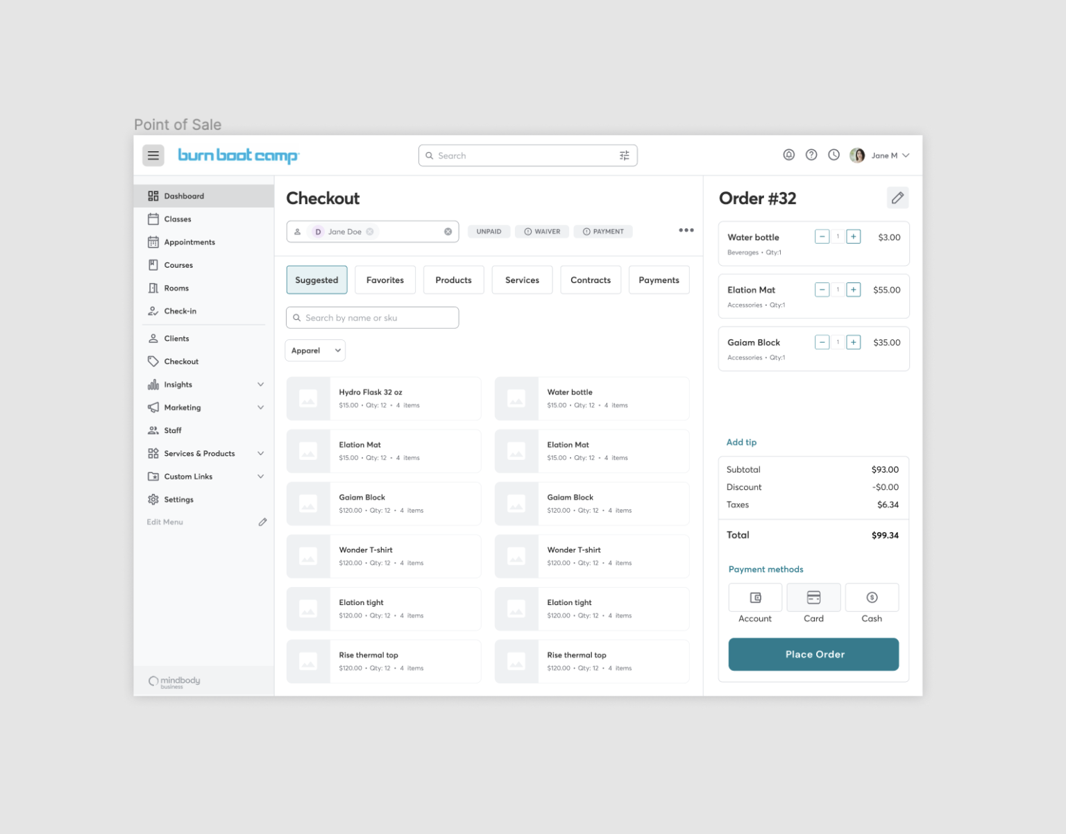
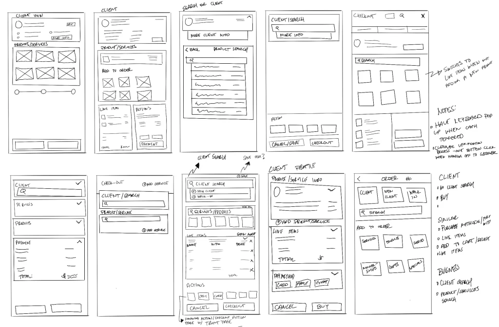
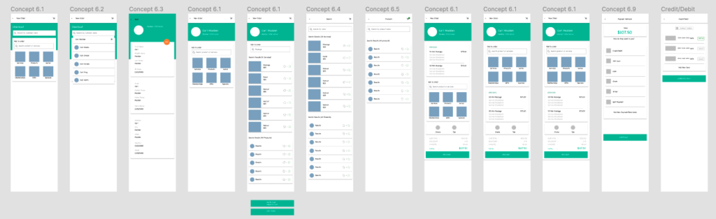
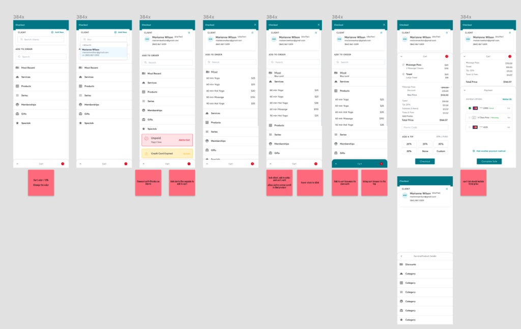
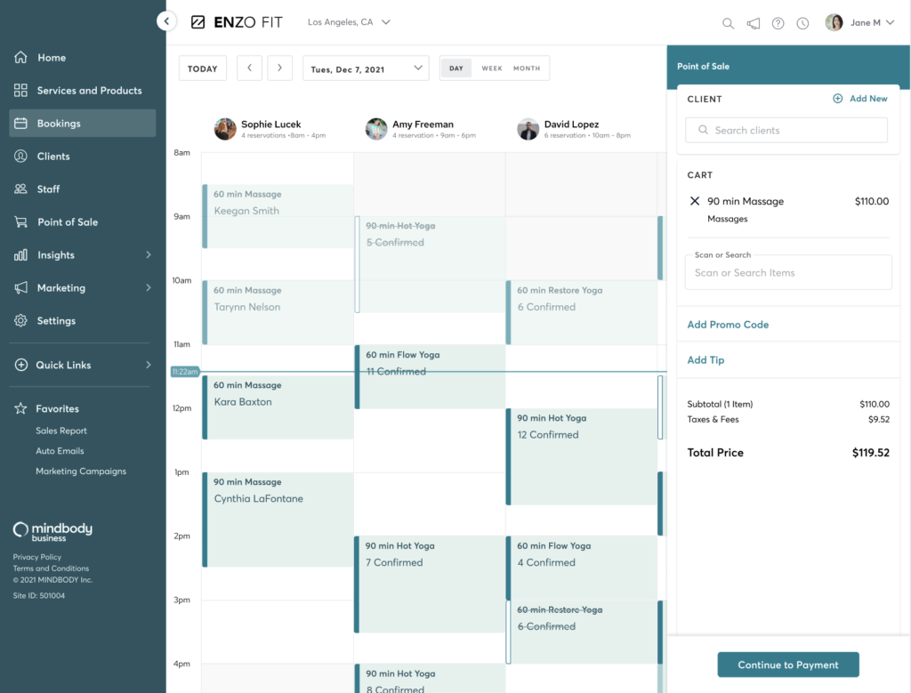
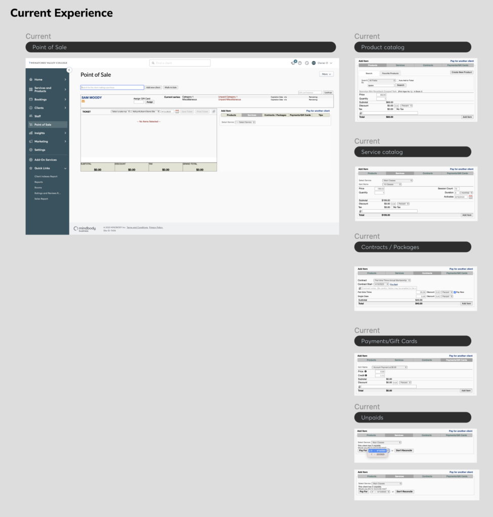
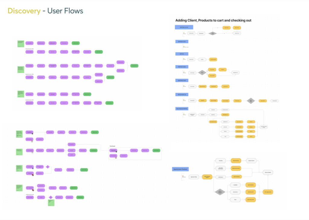
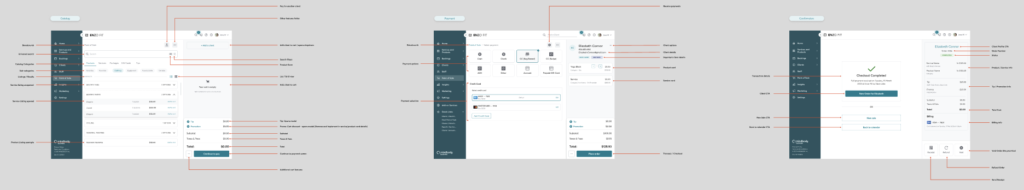
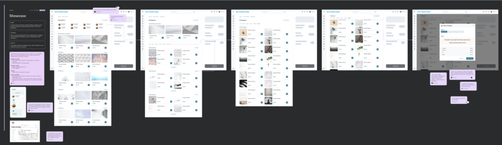
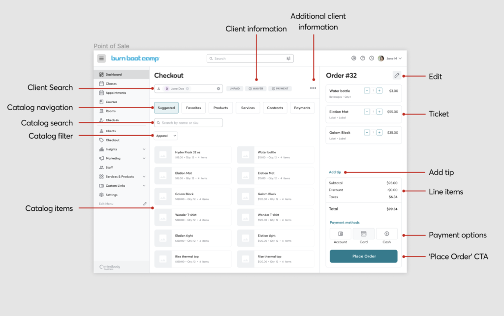
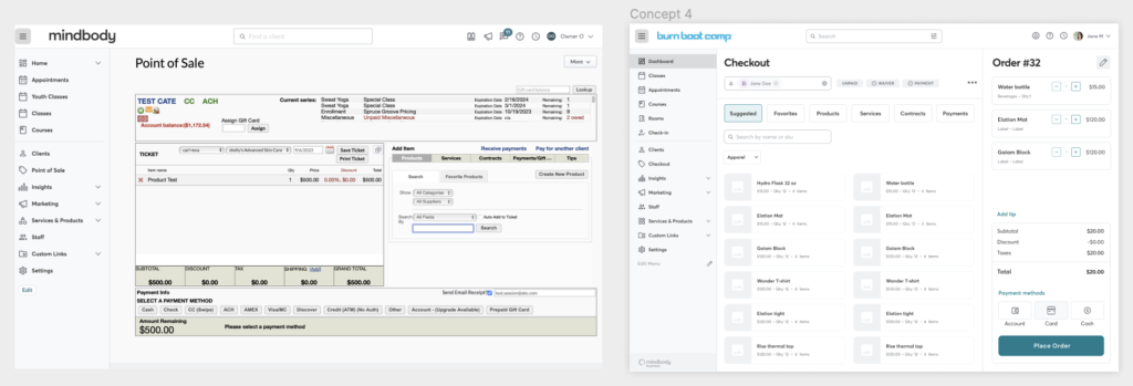
I concentrated on enhancing the user experience while preserving the essence of the existing version. By refining the user interface, I created a seamless and efficient transactional flow that catered to our clients’ needs.


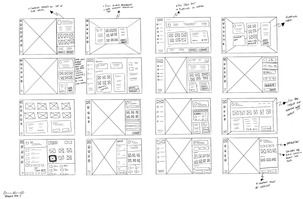
My approach revolved around consolidating essential components – catalog, cart, and payment processes – onto a single page.


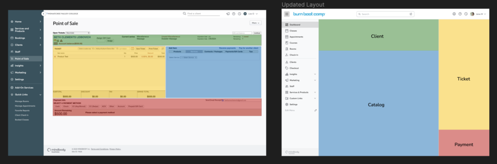
  • Allows businesses to effortlessly manage transactions while offering a comprehensive view of their product offerings.
  • Leveraging modals, I introduced a versatile interaction model that enabled various actions without interrupting the transaction flow.
  • Allows our clients to swiftly attend to tasks like adding products, applying discounts, and managing payment methods.
Main Concept

The result was a modernized user experience that retained familiarity for existing users while delivering a more focused and streamlined process. By prioritizing ease of use and efficiency, I empowered our clients to serve their customers efficiently and effectively within the MindBody Point of Sale system.

Before & After

Solutions:


  • Updated backend for faster interactions and inputs
  • Modern browsable catalog that adds functionality and cuts down time to find product
  • Left to right catalog to ticket interaction
  • Updated look and feel
  • Overall improved user experience

Lessons Learned and Future Recommendations:


  • Understand code limitations (I decided to learn basic code due to this)
  • Ask for more alignment 
  • Acknowledge the unique challenges and discipline required when designing a standalone product that is integral to the client’s revenue and business model
  • Emphasized the importance of thorough design reviews and questioning every design detail to ensure alignment with business goals and customer needs.

Updated side panel ‘Checkout’ experience: 


Consistent design language and experience for the alternative side panel.

Visual Consistency: 


With the help of core designers we contributed in the creation of the first ever custom design system for Mindbody to better align our user experience and strategy. All while we each were building out new experiences in the software.