Case Study

Mindbody
Branded App

Designing a custom branded app ecosystem that transformed how wellness businesses connect with their clients on mobile — and proved that great UX directly drives revenue.

Industry Wellness / SaaS
Role Product Designer
Platforms iOS & Android
Timeline 4 Months
Team Led design · with iOS & Android eng
Mindbody Branded App
Hear me talk about this project
0:00
01 — Overview

A Mobile Experience Built
for Thousands of Wellness Brands

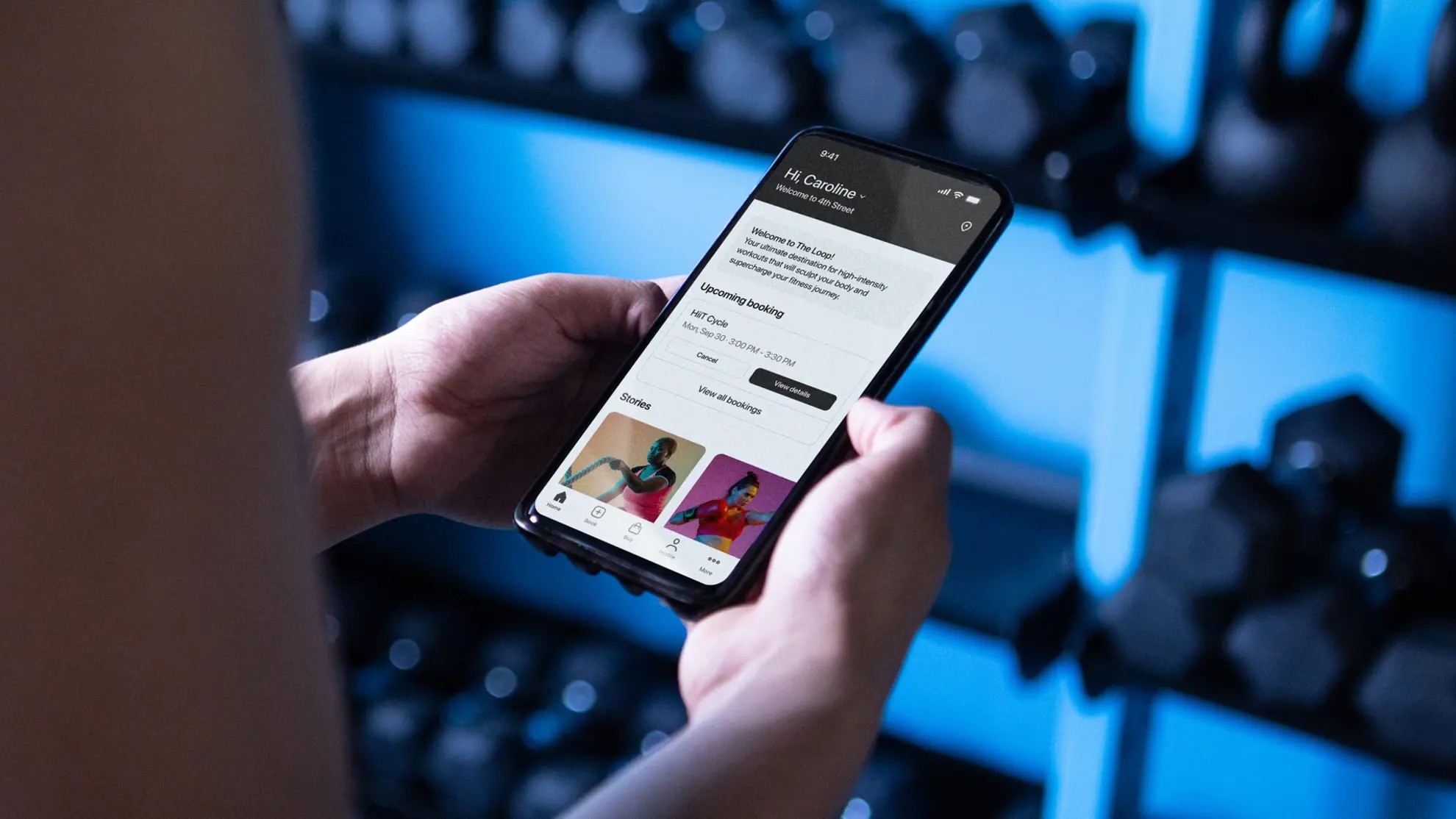
Mindbody's Branded App product lets wellness businesses — gyms, yoga studios, spas — offer their clients a fully custom-branded native mobile app. The problem: the existing app was built on outdated architecture, delivering a confusing, clunky experience that was driving clients away and flooding support queues.

I led the complete native redesign for both iOS and Android, focused on three core improvements: a cleaner interface that felt truly native, a map-based location discovery experience, and a dramatically simplified booking flow that reduced friction at every step.

2
Native platforms — iOS & Android, rebuilt on one shared design system
4mo
Research to production — two platforms, a new design system, and full usability validation
Support
A drop in studio support calls — clients stopped needing to phone the front desk to book
View Live Product
Mobile Design iOS Android UX Research Design Systems Material Design H.I.G. Usability Testing
02 — Problem Statement

Outdated Architecture.
Frustrated Users. Lost Revenue.

The existing Branded App was built on aging architecture and it showed. The location discovery model — a plain list with no spatial context — made it genuinely hard for users who visited multiple studios to find what they needed. The schedule view was dense and the booking flow buried confirmation steps in a way that felt like the app was trying to stop you from completing a purchase.

The result: low client adoption, high booking abandonment, and a flood of inbound support calls to studios that were paying Mindbody to handle this for them. The product was actively costing business owners time and money.

I need to quickly see my studio's schedule and book my favorite class without calling or navigating a clunky app. Half the time I just give up and call them.

— Olivia Hayes, Dedicated Fitness Client · User Research Interview
03 — My Role & How I Worked

Leading the Redesign
Across Two Platforms

I led the native redesign end-to-end for both iOS and Android — starting from drop-off analytics and interviews with clients and studio owners, through to a shipped design system. I worked closely with platform engineering on both sides to keep the experience genuinely native, not a shared web view in disguise.

Two decisions did most of the work:

Decision 01
A map, not a list
Clients who visited multiple studios had no spatial way to find or switch between them — the flat list was the single most-cited frustration in research. Leading the app with a map view rather than a directory is what made discovery feel effortless for people booking on the go.
Decision 02
Obsess over the booking flow
Analytics showed users abandoning mid-booking, mostly at a confusing time picker. I cut the flow to the fewest taps possible and iterated the time picker more than any other component in the project — because in scheduling, a single interaction pattern is the difference between a booking and a phone call.
04 — Design Process

How We Rebuilt It

01
Discovery
Quantitative + Qualitative Research
Analyzed drop-off data on the existing booking and location views. Conducted interviews with end-clients and business owners across studio types. Benchmarked top booking and travel apps to identify native mobile patterns that reduce friction.
02
Define
Insight Synthesis & Problem Framing
Mapped three core problem areas: location discovery, booking flow complexity, and platform inconsistency. Defined success metrics tied to booking completion rate, session frequency, and support call volume reduction.
03
Design
Native Redesign Across Both Platforms
Designed a map-based location discovery screen, a streamlined schedule view, and a simplified booking flow that cut required taps significantly. Built a dual-platform design system aligned to Material Design and H.I.G. with support for custom business branding.
04
Validate
Usability Testing & A/B Iteration
Ran moderated usability sessions focused on the map view and scheduling module — the two highest-friction areas. Conducted A/B testing on time picker variants. Iterated through multiple rounds until booking completion was fast, intuitive, and error-free.
05 — Impact

What We Delivered

Booking Frequency Climbed
Client usage and booking frequency rose meaningfully after launch — a direct result of the reduced friction in the new booking flow and map-based location discovery.
Support Calls Dropped Noticeably
When users can actually complete a booking without confusion, they stop calling the studio. Business owners reported fewer inbound support calls post-launch — a direct signal that the experience was working as intended.
Modern Scalable Foundation
Established a design system that could scale across hundreds of branded apps while maintaining native fidelity on both iOS and Android — positioning the product for long-term growth.
Shipped in 4 Months
Full redesign from research to production in 4 months — covering two platforms, a new design system, and multiple iterated prototypes validated through usability testing.
06 — Reflection

What This Project Taught Me

Learning 01
Native Fidelity Builds Trust
Users notice when an app doesn't feel like it belongs on their device. Respecting platform guidelines — Material Design on Android, H.I.G. on iOS — isn't just good craft, it's the foundation of user trust in a mobile product.
Learning 02
Complexity Hides in the Details
The time picker seemed minor but was the most iterated component in the entire project. Scheduling complexity demanded intense focus and persistence — the difference between a good experience and a frustrating one was often a single interaction pattern.
Learning 03
UX Is a Direct Business Driver
This project made the ROI of design visible in a way that's hard to argue with. When booking completion goes up, revenue goes up. When the app stops confusing people, support costs go down. Framing design decisions in business terms — not just user terms — is how you earn a seat at the product strategy table.
Next Case Study
Dardano's Shoes