Case Study
Dardano’s
Shoes
An e-commerce redesign that pivoted an 85-year-old family shoe store to digital: $106K in online profit in six months.
An e-commerce redesign that pivoted an 85-year-old family shoe store to digital: $106K in online profit in six months.
Founded in 1938, Dardano’s is a beloved family-owned shoe retailer in Denver, Colorado, known for quality footwear and a deeply personal in-store experience. When the pandemic erased their foot traffic, that reliance on physical retail became an existential risk.
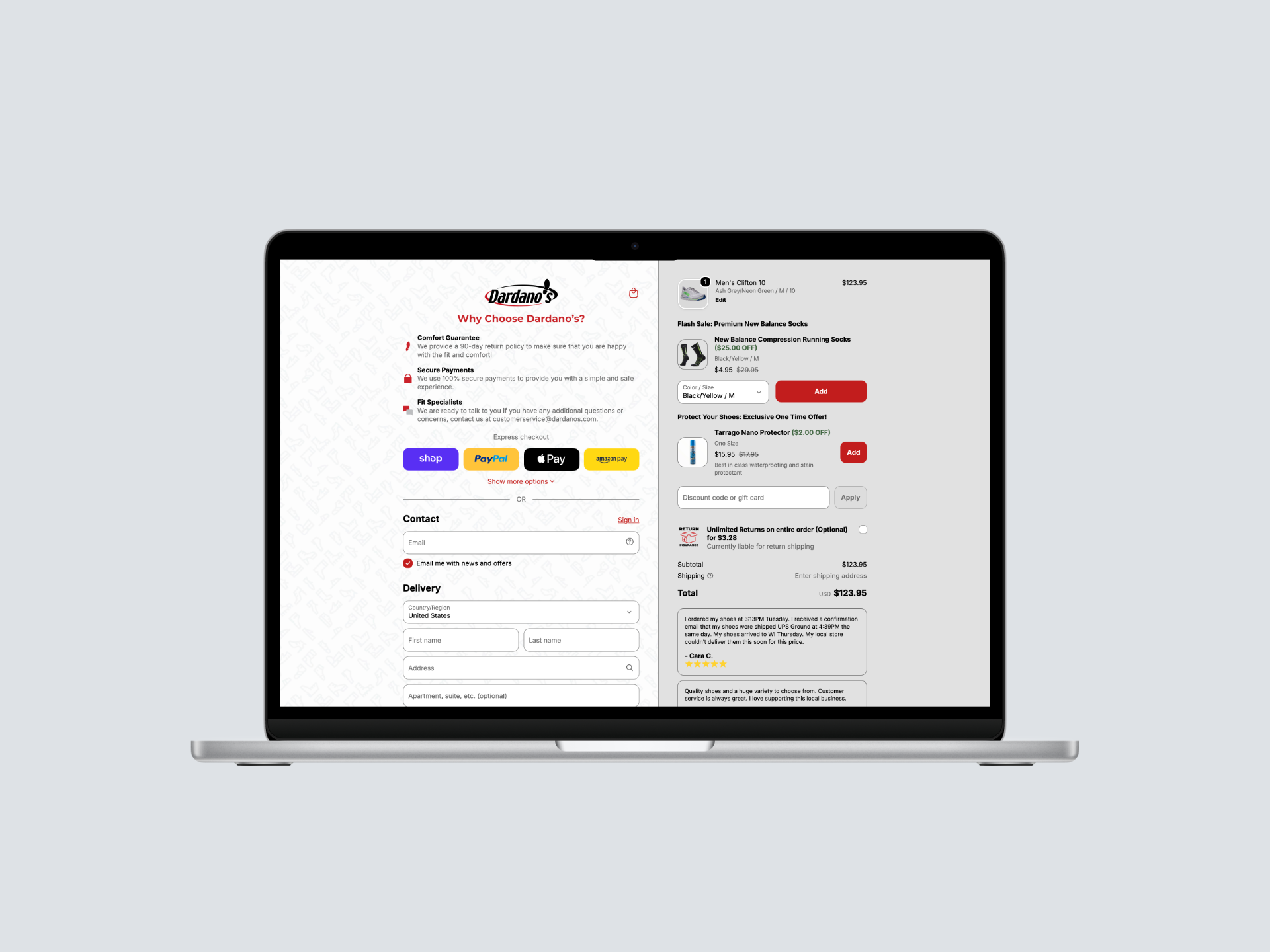
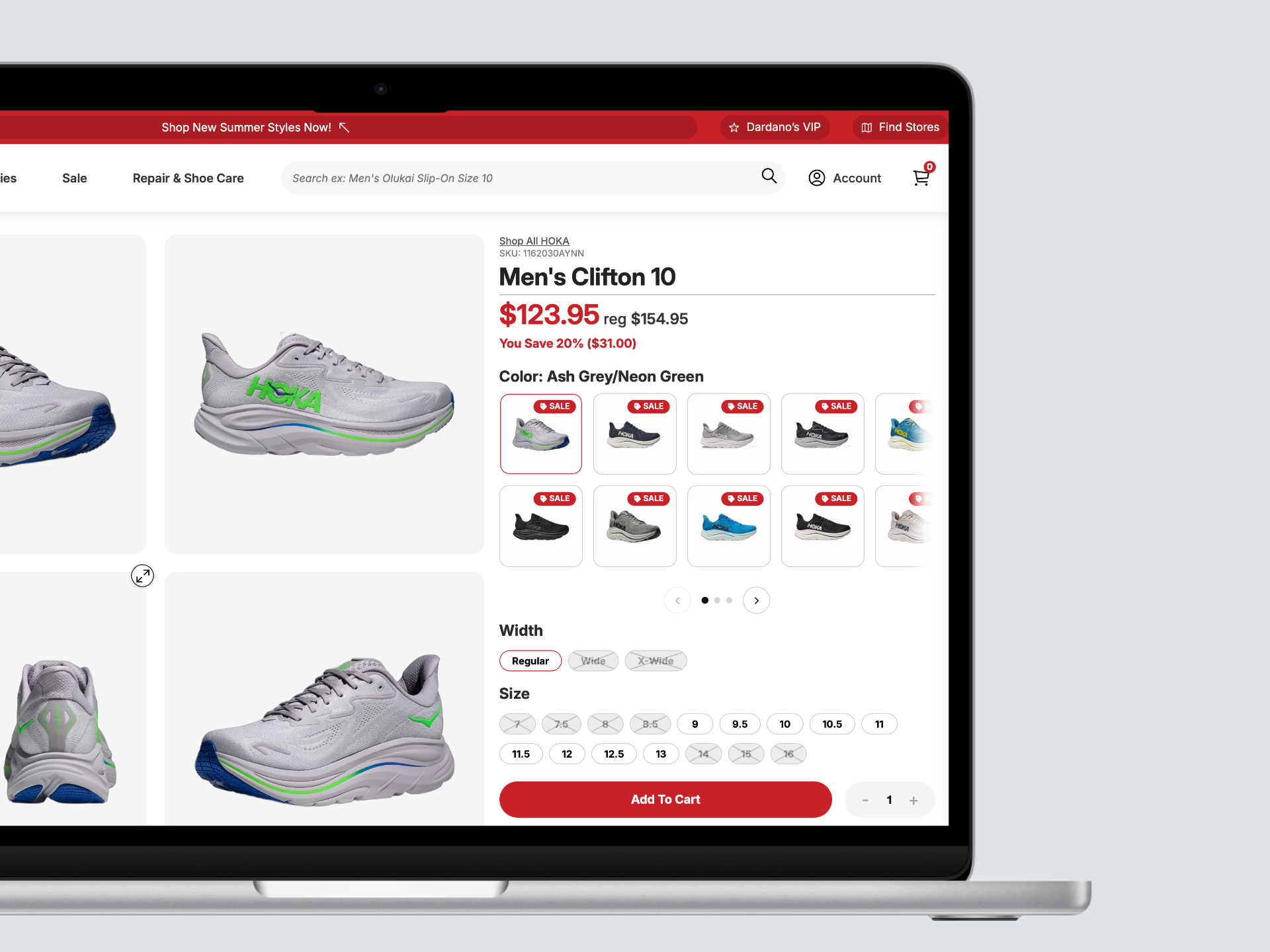
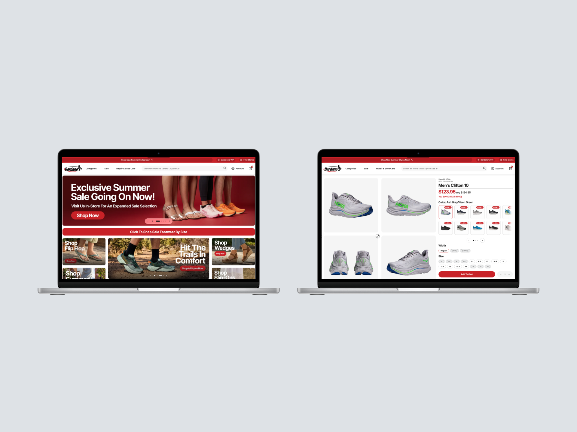
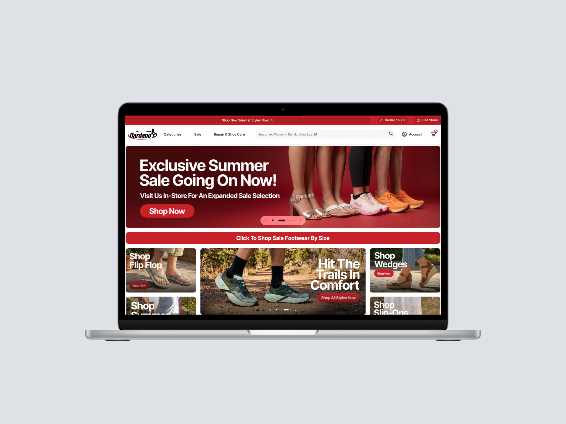
I led a rapid, full-scale redesign of Dardanos.com, turning a brochure-style site that had never really sold anything into a real e-commerce business that captured the brand’s warmth online and drove measurable revenue.
The old Dardanos.com had outdated visuals, confusing navigation, and an information architecture that buried products. Customers who loved the store in person had no equivalent online, so e-commerce sales were negligible.
When the pandemic closed the physical store, that weakness became a crisis. The site didn’t just underperform; it actively undermined a brand that deserved better, at the exact moment it was the only channel left.
I’m willing to pay more for quality and personalized service, but the website needs to make it easy to find what I want quickly, and trust that the fit will be right.
I was the sole designer on the project, working directly with the Dardano’s owners and partnering with one engineer through the build. I owned the entire design end-to-end: user research, information architecture, visual design, and the UI system, and worked side by side with the engineer to ship it without losing fidelity.
This wasn’t a hand-off-the-mockups engagement. I set the strategy, made the hard calls, and stayed in the build until it shipped. Two of those calls shaped the entire outcome: