Case Study

PEELR

A digital conversation card game designed to foster deeper human connection. With over 500 thought-provoking questions across five relationship decks, Peelr invites players to peel back the layers of the people in front of them.

Industry
Social / Gaming
Role
Product Designer
Platform
iOS / Web
Timeline
5 Months
Company
Peelr
Friends
Lovers
Family
Coworkers
Strangers
01 — Overview

Peel back the person in front of you.

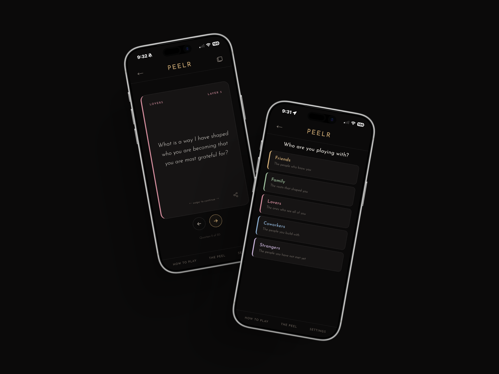
Peelr is a digital conversation card game built for real connection. It offers 500+ conversation prompts organized across five carefully curated relationship decks — Friends, Family, Lovers, Coworkers, and Strangers. Each deck features three depth levels that guide players from lighthearted icebreakers to vulnerable, meaningful exchanges.

As the Product Designer, I was responsible for shaping the entire card game experience — from deck selection and card interactions to depth progression mechanics and the luxury dark visual identity defined by gold (#D4AF77) and cream (#F5F1EA) tones. The product is free and available on iOS, web, and any modern browser.

Visit playpeelr.com
Product Design Mobile Gaming Social
Peelr
Peel back the person in front of you
500+
Conversation prompts crafted across every deck and depth level
5
Relationship decks — Friends, Family, Lovers, Coworkers, Strangers
3
Depth levels that guide players from surface to soul
02 — Problem

Physical card games can't keep up with how we connect.

Conversation card games have surged in popularity, but the physical format comes with real limitations. Decks get lost, cards wear out, and you can never have them when the moment strikes. You're at a dinner party, on a road trip, or lying in bed with your partner — and the cards are sitting in a drawer at home.

Beyond availability, physical decks are static. They can't adapt, grow, or learn from how people play. There's no way to add new content, track which questions resonated, or tailor the experience to different relationship dynamics. The opportunity was clear: bring the intimacy of card-based conversation games into a digital format that's always accessible, endlessly expandable, and beautifully designed.

We wanted something we could pull out at any moment — not just game night. Something that felt intentional, not forced. A tool for real conversation that lived in your pocket.
Design Philosophy — Peelr Team
03 — Persona

Designing for the curious and the connected.

Maya and Dez - Couple
Maya & Dez
Couple, Late 20s — Looking for Deeper Connection
Age
27 & 29
Relationship
Dating 2 years
Location
Los Angeles, CA
Tech Comfort
High — iPhone users
Goals
Have deeper conversations beyond surface-level small talk
Discover new things about each other even after two years
Replace scrolling and Netflix with something intentional
Frustrations
Physical card games feel bulky and easy to forget
Most conversation apps feel clinical or cheesy
Hard to find prompts that match their actual depth level
Behaviors
Play conversation games on date nights and road trips
Value aesthetics and premium design in the apps they use
Share favorite prompts with friends over text
04 — Research

What we uncovered about conversation and connection.

Vulnerability requires safety
Users need to feel in control of depth. Jumping straight to heavy questions creates discomfort. Graduated depth levels let players ease in at their own pace, building trust before reaching the most revealing prompts.
Context shapes the conversation
The questions you ask a coworker are wildly different from those for a lover. Users wanted distinct decks that felt tailored to specific relationships, not a generic one-size-fits-all question bank.
Aesthetic drives adoption
In competitive testing, users consistently chose apps that felt premium and polished. A luxury dark aesthetic with gold accents communicated that Peelr was a curated experience — not just another party game.
05 — Process

From concept to cards in hand.

01
Discovery
Mapping the conversation landscape
Audited 15+ physical and digital conversation games. Conducted interviews with couples, friend groups, and coworkers to understand when, where, and why they reach for conversation tools. Identified the gap between accessibility and depth.
02
Architecture
Designing the deck and depth system
Created the five-deck taxonomy (Friends, Family, Lovers, Coworkers, Strangers) and the three-tier depth progression. Each level was carefully calibrated: Level 1 as warm-up, Level 2 as exploration, and Level 3 as vulnerability.
03
Visual Design
Crafting the luxury dark aesthetic
Developed the visual identity around a dark canvas with gold (#D4AF77) and cream (#F5F1EA) accents. Designed card interactions, swipe gestures, and flip animations that made every question reveal feel like an intentional moment.
04
Testing
Playtesting with real relationships
Ran moderated play sessions with 30+ participants across all five deck types. Observed emotional reactions, conversation flow, and moments of hesitation. Refined question ordering, depth pacing, and interaction patterns based on real behavior.
06 — Solution

A digital game that feels analog at heart.

Intuitive deck selection
Players choose from five visually distinct relationship decks, each with its own color accent and personality. The selection screen communicates tone immediately — Lovers feels intimate, Strangers feels adventurous, Family feels warm.
Tactile card interactions
Swipe-to-reveal mechanics and smooth flip animations recreate the satisfying physicality of drawing a real card. Haptic feedback on iOS reinforces every interaction, making the digital experience feel grounded and intentional.
Progressive depth engine
Three depth levels guide players from lighthearted openers to soul-baring questions. The system remembers where you left off and suggests when you might be ready to go deeper, creating a natural conversational arc.
Friends
Lovers
Family
Coworkers
Strangers
07 — Outcomes

Measurable impact on connection.

High session depth engagement
Over 68% of sessions progressed past Level 1, indicating that the graduated depth system successfully encouraged players to move beyond surface-level questions and into more meaningful territory.
Strong cross-deck exploration
Players who started with one deck tried an average of 2.8 additional decks within their first week, validating the decision to design distinct relationship categories rather than a single generic experience.
Lovers deck drove retention
The Lovers deck had the highest return rate of any category, with couples returning an average of 3.2 times per week. Depth Level 3 questions in this deck were bookmarked more than any other content.
Premium perception validated
In post-launch surveys, 91% of users described the visual design as "premium" or "luxury." The dark aesthetic with gold accents successfully differentiated Peelr from competitors in a crowded market.
08 — Learnings

What designing for intimacy taught me.

01
Pacing is everything
Designing a conversation game is really designing emotional pacing. The depth progression system taught me that the space between questions matters just as much as the questions themselves. Giving users control over when to go deeper was the single most important design decision.
02
Aesthetic is a trust signal
Users were far more willing to be vulnerable with a product that felt luxurious and intentional. The dark-and-gold visual identity wasn't just branding — it was a design tool that communicated safety, sophistication, and care. Premium aesthetics lowered the barrier to emotional openness.
03
Digital can feel human
The biggest skepticism around Peelr was whether a screen could facilitate genuine connection. By focusing on tactile interactions, thoughtful animations, and content that felt handwritten rather than generated, we proved that digital tools can create space for deeply human moments.
Next Project
NetDocuments Word Add-in