Case Study

EZ Shoe
Repair

Transforming a confusing, jargon-heavy repair service into a clean, visual e-commerce experience — so customers could go from "I have no idea what I need" to a completed order in under five minutes.

Industry E-Commerce / Services
Role Lead Designer
Platform Web Application
Timeline 5 Months
Company EZ Shoe Repair
EZ Shoe Repair
01 — Overview

Making a Complex Service
Feel Effortless Online

EZ Shoe Repair is an online shoe repair service — a category most people still associate with dropping shoes off at a local cobbler. The challenge was getting customers to trust the process enough to order online, navigate the repair options confidently, and complete checkout without confusion.

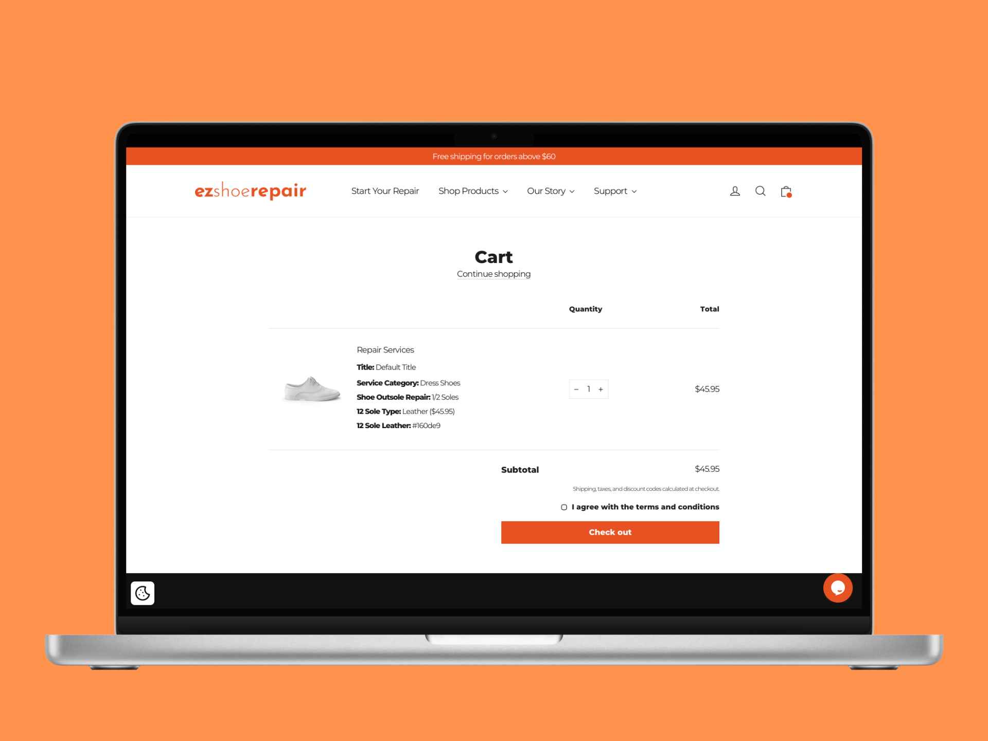
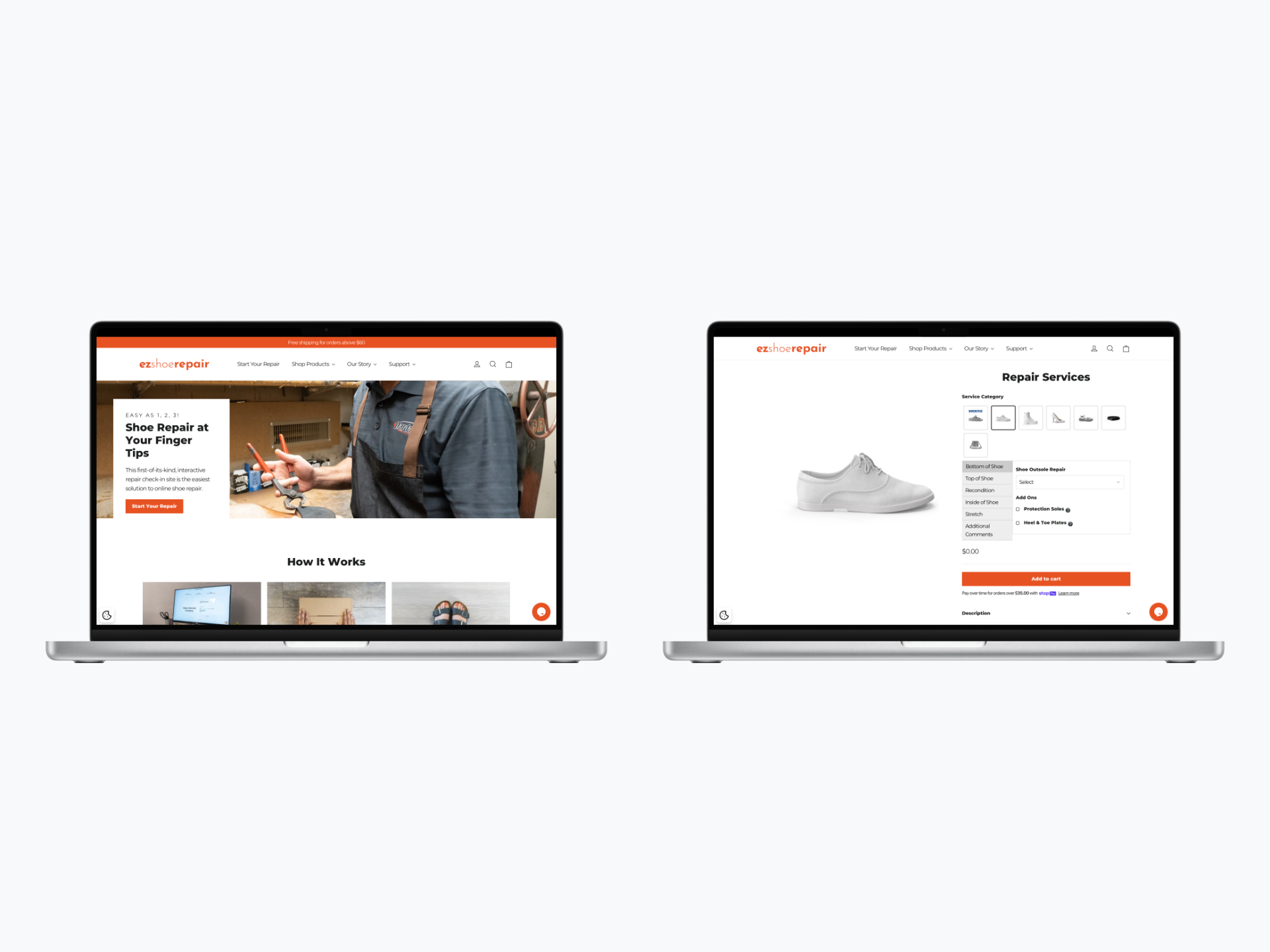
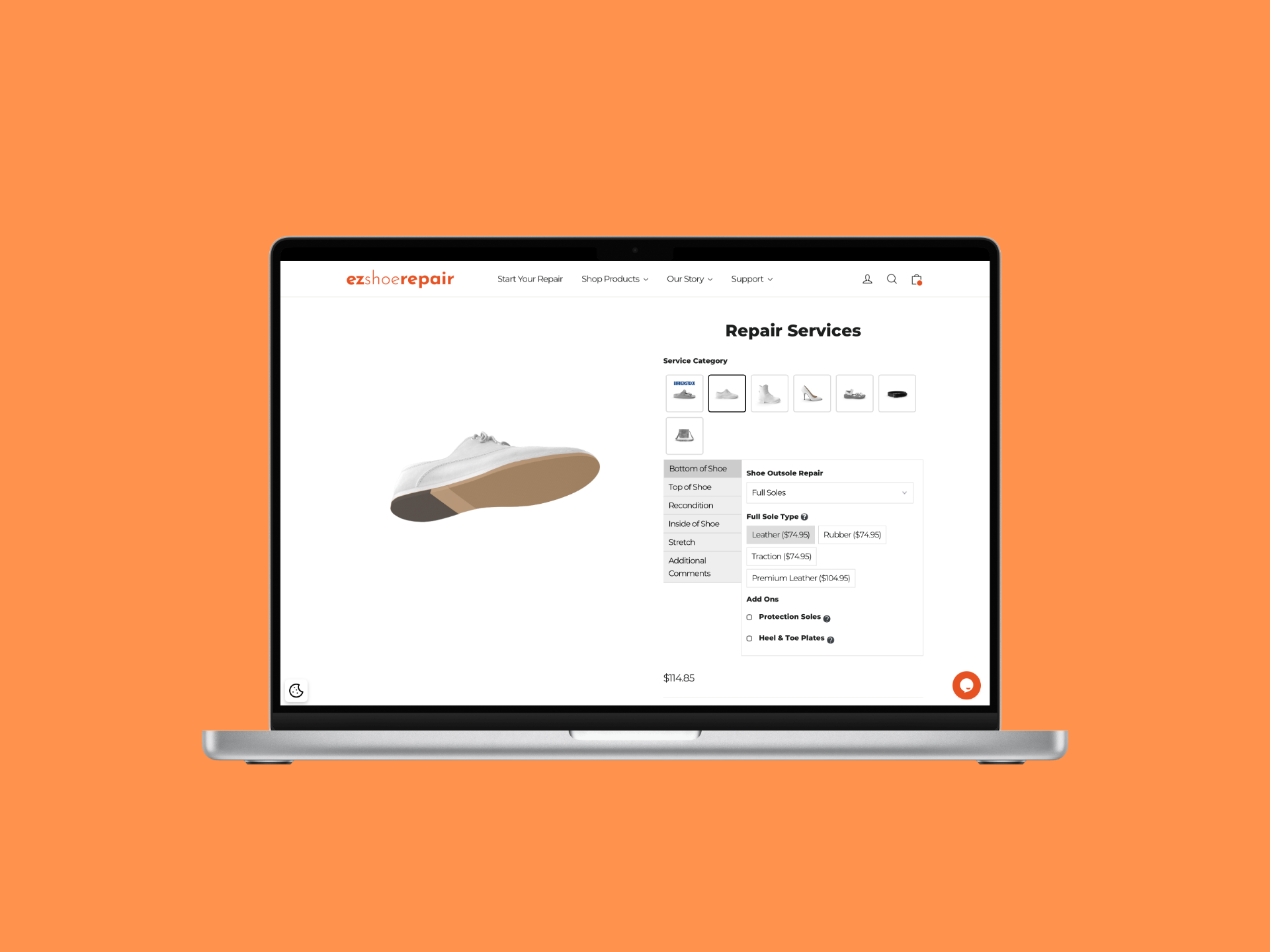
I led the full design of their e-commerce experience, creating a clean, visual, and educational checkout flow that replaced a long, jargon-filled form with an intuitive tile-based selection system — making the service accessible to a wide range of customers regardless of tech proficiency.

View Live Site
E-Commerce UX Checkout Optimization Conversion Rate UX Research A/B Testing Mobile Design Front-End Development
By the Numbers
Orders
Meaningful increase in completed online orders after launch — the old flow was actively blocking purchases from going through
5min
Target checkout time — from landing to confirmed order, with no prior knowledge of shoe repair terminology required
AOV
Average order value increased as better service discovery led customers to add repairs they previously wouldn’t have found
02 — Problem Statement

A Specialized Service Lost
in a Sea of Jargon

The existing online repair process was a major conversion barrier. Customers were met with outdated interfaces, lengthy text-heavy forms packed with technical terminology most people don’t know — sole replacement types, welt stitching, heel caps. The result was confusion, low trust, and abandoned orders.

The business couldn’t scale with a flow that actively pushed customers away before they could complete a purchase. The experience needed to be rebuilt from the ground up around clarity, education, and trust.

I just want the checkout to be quick and painless — no surprises, no unnecessary steps. I don’t know what half these repair options even mean.

— Amelia Chen, Goal-Oriented Professional · User Research Interview
03 — User Persona

Who We Designed For

Amelia Chen
Amelia Chen
Goal-Oriented Professional
Age
41
Location
Suburban Area
Tech Proficiency
Low
Primary Device
iPhone
Goals
Find the right repair for her specific issue quickly
Understand pricing before committing
Trust the service with valuable shoes
Frustrations
Jargon-filled repair options she doesn’t understand
Long irrelevant forms before checkout
Outdated sites that don’t feel trustworthy
Behaviors
Wants tasks completed in under 5 minutes
Abandons flows that feel complicated
Trusts brands with clear, clean design
💡
How Amelia shaped the design
Amelia doesn't know what "welt stitching" or "heel counter repair" means — and she shouldn't have to. That insight killed the text-based form entirely and drove the decision to lead every repair option with a photo and plain-language description before any price was shown. Her 5-minute patience threshold also set the hard ceiling for how many steps the entire flow could have.
04 — Research & Insights

Finding the Friction

I conducted customer surveys and usability testing with both new and existing customers, mapping exactly where trust broke down and confusion arose. I also analyzed competitor flows and traditional service models to understand what made customers feel confident enough to order without physically seeing the business.

🖼️
Users Needed Visual Guidance
Customers couldn’t select the right repair from text alone — they needed visual and educational cues at the exact moment of decision. Showing what a repair looks like, not just naming it, was the key to confident selection.
Less Input, More Selection
The checkout flow needed to shift from text entry to quick selection touchpoints. Every form field was a potential drop-off. The goal was to let users tap their way to checkout rather than type their way through it.
📱
Mobile Was the Primary Channel
Most users were ordering on mobile, often on the go. A responsive, thumb-friendly design with large touch targets wasn’t a nice-to-have — it was the primary surface the entire flow had to be designed around.
05 — Design Process

From Confusing Forms
to Visual Tiles

01
Discovery
Surveys, Usability Testing & Competitor Analysis
Ran customer surveys and usability tests on the existing flow to identify where users dropped off and why. Analyzed competitor service sites to understand what patterns built trust and reduced friction in online service checkout experiences.
02
Define
Mapping Barriers to Purchase
Synthesized research into three core barriers: inability to identify the right repair, lack of transparent pricing, and low trust in the overall experience. Defined success as a flow where users could get from landing to checkout in under 3 minutes with no confusion.
03
Design
Visual Tile System & Transparent Checkout
Replaced the text-heavy form with a visual tile-based repair selection system — each tile showing a clear image, a plain-language description, and upfront pricing. Designed a streamlined checkout that minimized required inputs and surfaced trust signals (reviews, guarantees, turnaround times) throughout.
04
Validate
A/B Testing & Mobile Optimization
Ran A/B tests comparing the new tile-based flow against the old text-form process. Conducted iterative usability tests on image use, content hierarchy, and pricing clarity. Optimized the mobile experience with large touch targets and a thumb-friendly layout for on-the-go ordering.
06 — Design Solution

Tap, Select, Done.

The final design centered on one principle: remove every possible barrier between a customer and a completed order. The result was a conversion-optimized flow that guided even low-tech users through a complex service decision in minutes.

🪄
Visual Repair Tile System
Each repair option presented as a visual tile with a clear photo, plain-language description, and upfront price — eliminating jargon and letting customers identify what they need at a glance rather than decoding technical terms.
💳
Transparent, Streamlined Checkout
Rebuilt the checkout flow to minimize form fields and maximize quick-tap selections. Integrated pricing cues, turnaround times, and service guarantees directly into the flow — so customers had all the information they needed without leaving the page.
📲
Mobile-First Responsive UI
Designed the entire experience mobile-first with large touch targets, a thumb-friendly layout, and progressive disclosure that surfaces only what’s needed at each step — keeping the flow fast and focused on any device.
07 — Outcomes

What We Delivered

The Checkout Finally Converted
The old flow was losing customers before they got halfway through. The redesigned tile-based experience removed every unnecessary step — and for the first time, the majority of users who started the flow actually finished it.
Customers Started Adding More Services
When repair options are clearly presented with images and plain descriptions, people discover services they didn't know they needed. Average order value increased as customers added services they would have previously missed or ignored in the old form.
Non-Tech Users Could Complete Orders Unassisted
Usability testing with low-tech participants — the segment most likely to abandon — showed they could move from landing page to confirmed order without asking for help. That was the real benchmark we were designing toward.
A Scalable Foundation for Growth
The tile system was built to scale — new repair services could be added as visual tiles without rethinking the flow. The client had a platform that could grow with the business rather than needing a full rebuild every time the catalog changed.
08 — Key Learnings

What This Project Taught Me

Learning 01
Simplify the Complex
Translating a specialized, jargon-heavy service into simple visual components was the key to unlocking conversions. The right balance of educational content and design brevity isn’t about dumbing things down — it’s about meeting users where they are and giving them exactly what they need to decide with confidence.
Learning 02
Ownership Drives Results
Being responsible for the full journey — from product strategy through front-end development — ensured every design decision was grounded in technical reality and tied directly to business outcomes. When you own the result, not just the spec, quality improves at every layer.
Learning 03
Detail-Oriented Discipline
Working on a product that is a core revenue source taught me a high level of dedication to validation. Every detail — image quality, pricing placement, button label — had a measurable impact on conversion. Thoroughness isn’t perfectionism; it’s respect for the user and the business.
Back to First Case Study
NetDocuments Word Add-in